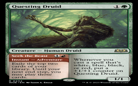
Okay, so I was messing around with some design stuff, and I got this idea to recreate the logo for this game, “Wilds of Eldraine.” I saw a few posts online about folks starting to play Commander with the new Wilds of Eldraine set, and it got me thinking about the game’s look and feel. It’s the second set on this Eldraine plane thing, right? I remember the first time they went to Eldraine, it was all about the Royal Courts and knights and stuff. People really dug that vibe.
I figured, why not give it a shot? I started by grabbing a few reference images of the original logo. Just Googled it, you know? Then, I opened up my design software – nothing fancy, just the usual stuff I use for my blog’s visuals. I started with the basic shapes. The “Wilds of Eldraine” logo has this cool, kind of wild, untamed look to it, with thorny vines and stuff. It’s pretty different from the knightly theme they had before.
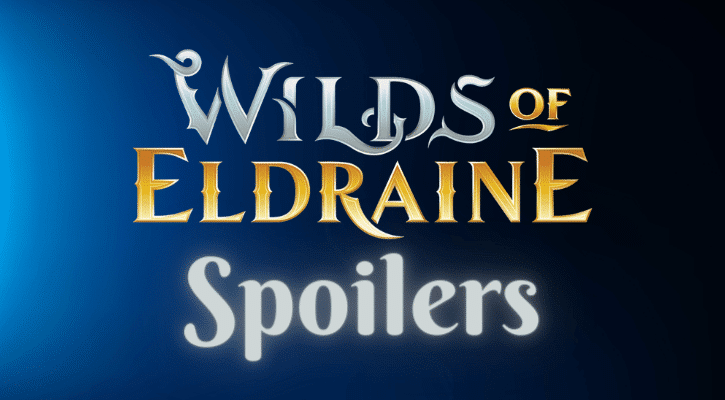
First, I worked on the text. I picked a font that looked kinda medieval but also a bit rough around the edges. Not too clean, you know? I typed out “Wilds of Eldraine” and started playing around with the size and spacing. I wanted it to look strong and bold, but also a little bit chaotic, like the wilds themselves.
Then came the fun part – the vines. I sketched out some twisty, thorny vines on a piece of paper first, just to get a feel for how they should look. Then, I started drawing them in the software. I made sure they wrapped around the text, overlapping in some places to give it that overgrown feel. I added some leaves here and there, making sure they looked wild and not too perfect. Some leaves are bigger, some smaller, some are partially hidden behind the vines – you get the idea. I added these cool thorns all around to make it look like someone found this in the forest.
Once I was happy with the basic design, I started messing with the colors. I wanted something that felt earthy and natural, but also a bit magical. I ended up going with a deep green for the vines and a lighter, kind of golden color for the text. It gave it a nice contrast and made the text pop. The golden text color reminds me of something valuable that you would find in a forest, making it more mysterious.
Here’s a breakdown of what I did:
- Gathered references: Looked up images of the original logo.
- Chose a font: Picked something that looked medieval and a bit rough.
- Drew the vines: Sketched them out, then drew them digitally, wrapping them around the text.
- Added details: Put in some leaves and thorns to make it look more overgrown.
- Picked colors: Went with a deep green for the vines and a golden color for the text.
It took a few hours, and a lot of tweaking, but I’m pretty happy with how it turned out. It’s not an exact replica, but I think it captures the spirit of the “Wilds of Eldraine” logo. It was a fun little project, and it’s always cool to see something you imagined come to life on the screen. Maybe I’ll use it for a future blog post about the game or something. Who knows?


