Okay, so, I was messing around with this idea for a logo for Hammond Robotics, you know, that big, bad company from the Titanfall and Apex Legends games? I’ve always been kind of fascinated by their whole vibe – that futuristic, industrial, kind of ominous feel. So, I decided to give it a shot and try to design my own version of their logo. Just for fun, you know?
First, I spent some time just looking at anything I could find about them. What are they? They make robots and weapons, cool, cool. And they are like, a big deal in that universe. I read up a bit on their history in the games, just to get a better feel for them. The more I read, the more I got this picture in my head of this giant, powerful corporation that’s all about technology and, well, maybe not always using it for the nicest reasons.
Then came the sketching. Oh boy, did I sketch! I grabbed my notebook and just started doodling. I wanted to capture that feeling of power and advanced technology, but also maybe a hint of something darker. You know, like, they’re not just making toasters, they’re making war machines! I played around with different shapes. I tried sharp angles, like in their existing logo in the game, because that always feels kind of aggressive and high-tech to me. And then I tried some circles and curves, but it just didn’t feel right. It felt too friendly, and Hammond Robotics isn’t exactly known for being friendly.
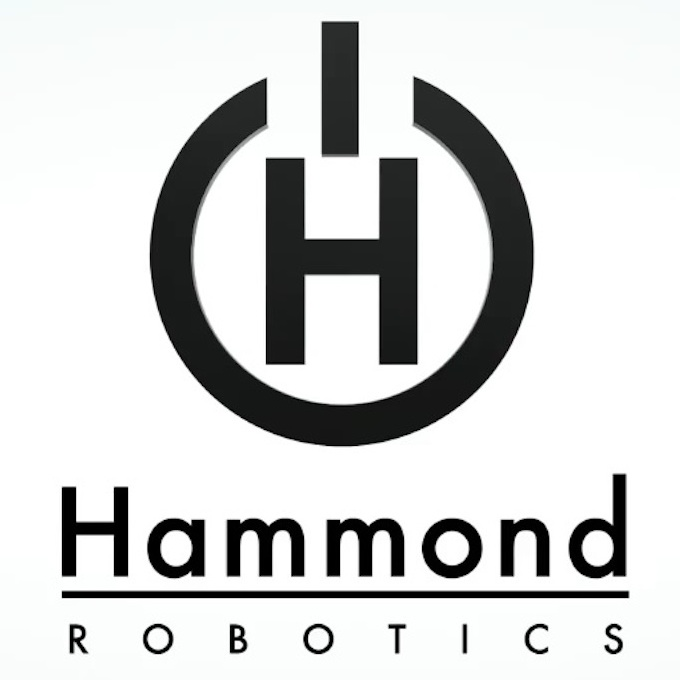
After a bunch of rough sketches, I started to zero in on a design that I liked. It was based on the letter “H”, obviously, for Hammond, but I stylized it. I made it look kind of like a building, or maybe a robot’s head, with those sharp angles I mentioned. I also added some lines and shapes around it to make it look more complex, more like a piece of machinery. I wanted it to look like you could almost see the gears turning inside, you know?
Once I had a sketch I was happy with, I moved to the computer. I used a design program to recreate the sketch and clean it up. This was the tricky part. I had to make sure all the lines were straight and the angles were precise. I played around with different colors. Initially, I went with dark, metallic shades, like grays and blacks, to give it that industrial feel. It looked okay, but it was missing something. It didn’t pop. So, I experimented with adding a touch of red, like the color of a warning light, or maybe… blood. Yeah, that sounds about right. And that did the trick! It made the logo look more menacing and impactful.
I kept tweaking and refining the design, adding details, adjusting the colors, until I finally had something I was proud of. It was a simple, yet powerful logo that, in my opinion, captured the essence of Hammond Robotics. Here is what I did:
- Sketched a bunch of ideas, focusing on sharp angles and a generally menacing look.
- Focused on the letter “H”, stylized it to resemble a building or a robot’s head.
- Digitized the sketch using design software, cleaned up the lines and angles.
- Experimented with colors, eventually adding a touch of red for that “warning” vibe.
- Refined the design until I was satisfied that it represented the company’s character.
It was a fun little project, and it really made me appreciate the thought that goes into designing even a simple logo. It’s not just about making something that looks cool, it’s about telling a story and creating a feeling. And for a company like Hammond Robotics, that feeling is power, technology, and maybe just a little bit of fear.


