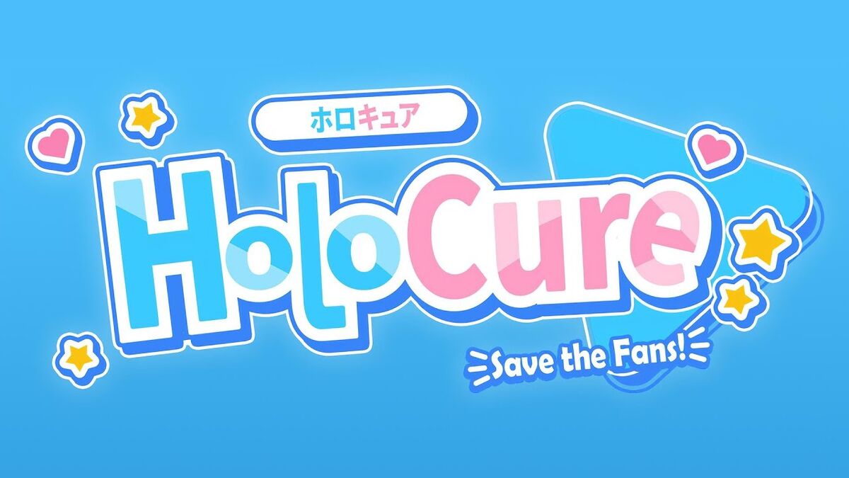
Okay, so I wanted to mess around with making a logo, specifically for HoloCure. Here’s how it all went down.
First, I gotta say, I’m no design pro. I just like messing around with stuff until it looks kinda cool. So, I jumped right in.
Getting Started
I started by, you know, just thinking about what HoloCure is. It’s that fan-made game, all pixel-y and packed with VTuber references. So, I knew the logo had to feel retro and kinda… cute, I guess?
- Brainstorm Dump: I jotted down a bunch of words that came to mind: “pixels,” “retro,” “VTubers,” “cute,” “game,” “colorful.” This helped me get a feel for the vibe I was going for.
- Looking at stuff: I checked out old-school game logos like mega man and other related games, tried to understand what I liked about them.
The Messy Middle Part
This is where things got, well, messy. I opened up my trusty image editor (nothing fancy, I promise) and started throwing shapes together.
- Shapes and Stuff: Started with some basic squares, thinking of the pixel art style. Tried arranging them, stretching them, making them different colors… it was a lot of trial and error. A LOT.
- Colors Colors Colors: I played around with bright, vibrant colors. HoloCure’s got that lively feel, so I wanted the logo to pop. Picked a bunch, swapped them around, got frustrated, picked different ones… you know the drill.
- Font Fiasco: Fonts are HARD. I wanted something that looked kinda retro but still readable. Scrolled through a million options, tried bold ones, skinny ones, pixelated ones… it was a headache.
I must’ve spent hours just tweaking things. Moving a pixel here, changing a color there, staring at the screen, wondering if it looked any good at all. I even asked my friend for their opinion. They said it was “okay,” which, you know, is better than “terrible,” I guess.
Finally Getting Somewhere
After a bunch of messing around, I finally started to see something I kinda liked. It wasn’t perfect, but it felt like a HoloCure logo.
- Refining the Mess: I started cleaning up the shapes, making sure the pixels were aligned (as much as I could, anyway), and picking a color palette that I was mostly happy with.
- The Font (Finally): I settled on a font that was kinda blocky and had that retro feel. It wasn’t exactly what I imagined, but it worked.
- Adding…Details?: I tried adding some little extra touches, like a subtle gradient or a tiny outline, just to make it a little more interesting. Not sure if it actually helped, but hey, I tried.
And… that’s pretty much it! I ended up with a logo that I think represents HoloCure. It’s definitely not professional-level, but I had fun making it, and that’s what matters, right?
This whole thing was just a fun little experiment. It reminded me that even if you’re not an expert, you can still create something cool if you just mess around and keep trying. And hey, sometimes the “messy middle part” is where all the good stuff happens.