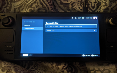
Okay, so I wanted to mess around with making a logo, specifically the Holocure logo. I’ve seen it around, thought it was cool, and figured, “Why not try to recreate it?”
First, I opened up my go-to design program. I’m no pro, but I know the basics. I started with a simple text layer, just typing out “HoloCure.” The original logo has this kinda chunky, bold font, so I spent a good while just scrolling through my font list. I finally found something that looked close enough – not perfect, but it’ll do.

Next up was the tricky part: the effects. The Holocure logo has this cool, almost 3D-ish outline, and some inner shadows. I started by duplicating the text layer a couple of times. The bottom layer, I made it a darker color and shifted it down and to the right a little bit. This gave it that basic “shadow” effect.
Then, I played around with layer styles. I added a stroke to the main text layer, using a color similar to the shadow, but a bit lighter. I fiddled with the stroke size until it looked about right. This created the outline effect I was going for. Getting the inner shadow effect was all a game of experimenting with Inner Shadow settings. Lots of clicking and dragging sliders until I was satisfied. Seriously, I spent a ridiculous amount of time here, moving things by like, a single pixel at a time.
My Result:
- It’s not an exact replica, that’s for sure.
- The colors might be slightly off.
- The font is not exact.
- But, you know, it looks like the Holocure logo!
Honestly, it was a fun little project. I learned a few new things about my design software, and it gave me a greater appreciation for the folks who actually design these things professionally. It’s harder than it looks! I’m pretty happy with how it turned out, even if it’s not perfect. Might even use it for something, who knows!


